The Logo Challenge
As everyone might have noticed, the beta website received a preliminary logo as part of the rebrand. In this challenge, everyone is invited to improve the current PINE64 community logo and to provide their ideas. The draft logo is intended to act as an inspiration for ideas in which present design can be improved.
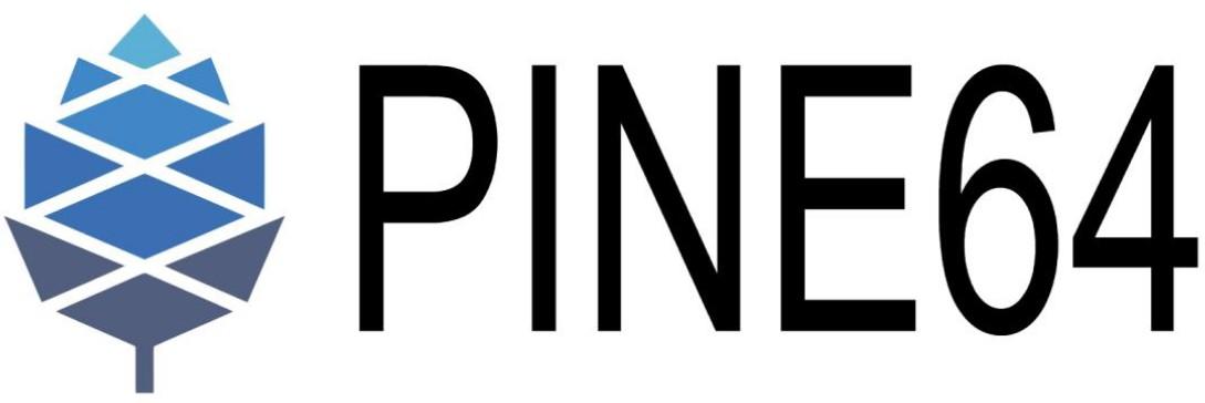
The current logo of the PINE64 community is less than optimal. Here it is:

Room for improvement
Concerns with the currently design include multiple points:
The heavy pinecone logo and the thin text are in a strong contrast due to the width of the different elements. Black elements are generally considered as “heavy”, which creates a tension with how thinly the text is written. The pinecone logo uses lighter colors on the top and heavier on the bottom, while the text is equally heavy throughout the text and on a fixed base-line.
There is also a contrast created with the coloring. On the left side there are four different blue colors used on the logo, while on the right side black is introduced. A general rule of thumb is to avoid using more than 3 colors.
The colors of the cone are also heavily desaturated, which is boring to look at.
The font choice is not great either. Straight lines, unfriendly, over-serious, no fun.
And there are many more issues (such as scalability, invertibility and many more).
An initial idea
When looking at something for a very long time, we get used to it. The old Pine64 community logo is something many people have grown accustomed to over the years. To help bring it to a new direction the logo could go, the author created a preliminary draft for how the logo could look like:

This draft addresses some of the above mentioned concerns. The color palette is reduced to a reasonable amount, the community aspect is added, the text is streamlined to the pinecone style and a considerably more playful font was used - Ubuntu, if you wonder. The SVG file compatible with Inkscape can be found here for download.
While this preliminary version is nicer to look at than PINE64’s current logo pictured above, it isn’t the final incarnation. Everything goes. Now here comes your chance!
The challenge
A new logo is needed. Be creative, bring in your best ideas, discuss it on all platforms! Got a fun idea, got something in a completely different direction, got a sketch on paper or got constructive feedback for the new ideas? - your input is wanted! There may just be a great prize for the winner of the contest.
Join the community platforms to bring your ideas in.


